There is a moment at most events — somewhere between guests finding their seats and the first drink arriving — where someone points. Not at the flowers. At the letters glowing at the far end of the room. Large light up letters do something most decor never manages: they hold attention past the first glance. Most styling peaks the second guests notice it. These do not.
They Shape the Room, Not Just Fill It
Put a display at the far end of a venue and guests walk towards it. Nobody directs them. No rope, no usher. The light just pulls. In bigger venues this matters more than people realise — without a focal draw, crowds bunch near the bar and the rest of the space sits empty in photographs. A well-placed display spreads guests through the room without any effort from the host. That is a logistics problem quietly solved by a styling choice.
The Glow Is Not Just Aesthetic
Harsh overhead lighting is the most common complaint from photographers working in hired venues. Garden marquees, converted warehouses, community halls — built for function, not atmosphere. Fairy lights help but lack mass. What illuminated letters produce is different. The warmth covers a real area, adds depth to flat backdrops, and shifts how skin tones photograph without anyone touching a camera setting. Photographers notice it immediately. Guests just feel like the room looks right.
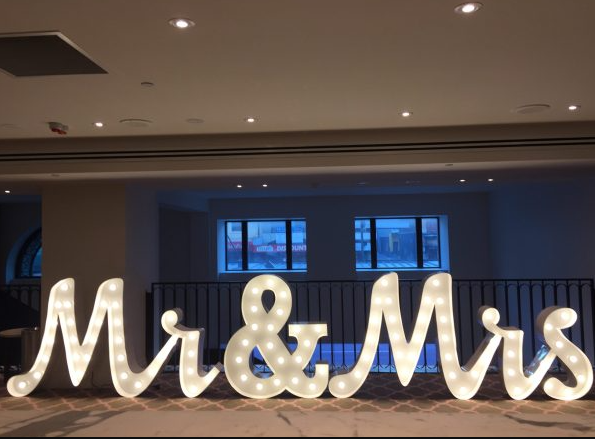
The Word Matters More Than the Font
Clients almost always ask about font before the word itself. Wrong order. Initials photograph cleanly but do not land emotionally when guests walk in. A word does. The right one sets the tone of a room before anyone has found their seat. Stylists who spend real time on word selection — rather than jumping straight to sizing and finish — get consistently stronger feedback after events. The letters are identical. The word is where everything actually shifts.
Corporate Clients Figured This Out First
The wedding market brought illuminated letters mainstream. Corporate events pushed the format further. Printed banners at a brand activation get glanced at and walked past. A lit display standing at full height gets photographed, shared, tagged. The reach generated by a well-placed large light up letter display at a product launch can outrun what the event’s own content team produces. Brands running experiential activations have quietly started building this into their budgets as a deliberate line item.
Outdoor Events Are a Different Problem
In direct afternoon sunlight, the glow disappears. This catches clients off guard — they picture the night shots and book for an outdoor afternoon event without adjusting expectations. The fix is placement. Illuminated letter displays need something dark behind them to hold in daylight. A hedge, a draped wall, the shaded end of a marquee. With the right backdrop the scale and typography carry the display even when the bulb is barely visible. Without it, the whole thing flattens out.
Script or Block — the Room Decides
Script gets chosen more often because people decide based on feeling rather than function. In intimate settings, that works. Push it into a large venue and legibility falls apart from any real distance. Block reads across a room without trouble and photographs with clean graphic weight. In smaller spaces it can feel cold. Neither is better. The size of the room makes the decision — not the mood board, not what looked good at somebody else’s event.
What They Remove from the Frame
Scuffed walls, exit signs, speaker cables running along skirting boards. Every venue has something behind the styling zone nobody wants photographed. Usually it ends up in the shot anyway because nothing pulls the eye away. A lit display changes that. The camera finds the light and rests there. Whatever sits beyond the decor stops registering. It improves photographs by removal, not addition.
Conclusion
Trends in event styling come and go fast. Large light up letters have avoided that cycle because they are not really a trend — they are a practical fix for problems venues consistently throw at stylists. Crowd flow, flat lighting, awkward backdrops, outdoor brand visibility. Used with real intention rather than habit, they remain one of the most quietly effective elements in any event kit.