
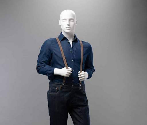
Menswear retail has a specific problem that most shop floors never fully solve. Clothing that looks considered and deliberate on a body looks anonymous, folded on a shelf or hanging on a rail. The gap between those two presentations is not small — it is often the difference between a customer stopping and a customer walking past. Male mannequins have occupied this space in retail for a long time, but the way they are chosen and used varies enormously, and that variation shows directly in how well a shop floor performs.
Fit Communicates What Words Cannot
There is something particular about menswear fit that resists description. A well-cut blazer with the right shoulder width and a clean chest roll does not read the same way in a product description as it does on a form that wears it correctly. Customers standing in front of a dressed display are not consciously analysing construction — they are reading silhouette, proportion, and ease in a fraction of a second. That reading either produces desire or it does not. No amount of descriptive copy on a nearby sign replicates what a well-dressed form communicates instantly and without words.
Why Abstraction Outperforms Realism
This surprises many retailers the first time they encounter it. Highly realistic male forms – detailed facial features, natural skin tones, and expressive poses – tend to pull visual attention towards the face. That is the wrong destination for a display whose entire purpose is to sell a garment. Abstract forms with minimal or no facial detail keep the eye moving through the silhouette rather than stopping at the head. The clothing becomes the subject. This is not an aesthetic preference — it is a documented pattern in how visual attention moves through retail environments, and the best display designers have understood it for years.
Posture Is Editorial
A male mannequin standing with rigid symmetry — arms parallel to the body, weight evenly distributed, facing directly forward — communicates something closer to a catalogue stock image than a real person wearing real clothes. It is technically correct and visually inert. Forms with considered posture tell a different story. A slight weight shift, one hand relaxed at the hip, a fractional turn at the shoulder — these adjustments make the garment look inhabited rather than displayed. Customers respond to inhabited clothing. It gives them something to project onto, which is precisely what a purchase decision requires.
Groupings Create Context
Single figures work for certain applications, but the real commercial strength of male mannequins in menswear retail comes from groupings used with spatial intelligence. Two or three forms positioned with deliberate relationships to each other — different heights, complementary poses, and a natural eyeline between them — produce something that functions more like a scene than a display. Scenes create context. Context sells lifestyle rather than individual garments. For brands whose customer is buying an identity as much as a product, this distinction matters considerably. A single blazer on a single form sells the blazer. Three forms in a considered arrangement sell the world the blazer belongs to.
Surface Finish Is a Decision, Not a Detail
Most retailers choose mannequin finishes based on what looks appealing in isolation. That is the wrong frame. The relevant question is what the finish does to the clothing presented on it. A warm matte grey recedes visually and allows fabric texture, colour, and pattern to lead. A high-gloss white or metallised finish creates visual competition — the form draws the eye rather than surrendering it to the garment. For tailoring and formal menswear, this competition is genuinely damaging to the display’s effectiveness. For sportswear with bold colourways and graphic elements, a more assertive finish can work — but only when the relationship between form and garment has been thought through rather than assumed.
Conclusion
The shop floors that consistently convert browsers into buyers tend to share a common characteristic — the display decisions were made deliberately rather than by default. Male mannequins chosen for the specific garment category, the brand’s visual language, and the spatial logic of the floor does commercial work that is easy to underestimate until it is absent. When that work is done well, customers do not notice the forms. They notice the clothes. That invisibility is the point.
